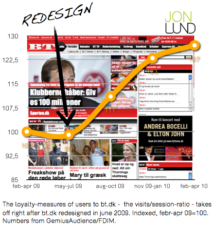
Danish news-sites ekstrabladet.dk and bt.dk both redesigned in the spirit of ugly duckling Norwegian success-site vg.no. The result is anti-aesthetic. And it works. This is what I found, when I digged into the stats.

Sharper editorial prioritization, better overview and more options for the user to choose from. This is the essence in the wave of redesign which have washed upon the shores of the Danish online scene for the past two years, following the success of Norwegian vg.no. The redesign, and the new editorial focus brought with it, are clearly marked in the site-stats of ekstrabladet.dk and eb.dk – the two largest Danish newspaper websites: loyalty and stickiness both takes off following the two sites redesigns.
Sticky B.T., big brother Ekstra Bladet
In particular I find the loyalty of B.T.-users to surge following their June 2009-redesign. Users returns more often; the number of visits per user having growing 27 percent comparing pre- and post-redesign periods. Also I find post-redesign bt.dk to be much better at keeping users at the site, once they’ve hit the site. In average users now conducts 28 percent more pageviews. Bt.dk has become more sticky.
Also the March 2009 redesign of ekstrabladet.dk has let its marks, falling somewhat below those of bt.dk, however. Loyalty increased 13 per cent, stickiness seven.
Before running of to wreck up your site, you should notice a few aspects. First, bt.dk owes parts of their success to the relatively poor pre-design performance. They simply had low-hanging fruits, ready to be picked up. Another, and vital, part of their success is due to a reorganization of the entire editorial staff at B.T., leading all journalists to write to and for both print and online-editions, gearing up the editorial machine and enabling it to take full advantage of the opportunities offered by the redesign.
Ugly duckling
The Norwegian VG-design in this way proves it’s effectiveness also in a Danish context. First time I laid eyes on vg.no I couldn’t believe what I saw. The site was – and is – … hmmm… ugly. Headlines being written in all kind of different sizes, a page-layout looking like a garbage can. Lots of annoying animated graphics and ads. And yet a huge success in terms of traffic.
It was only later I realized the brilliant master-plan behind the site. How it freed the storys from the confinement of standard database-driven layouts, giving the editors and journalists a set of great tools, allowing them to tap into the new powers of the web. I’ve wrote about in this post “vg.no – revealing the beauty of an ugly duckling”
Download full report (in Danish)
Send, download and print. Price: 345 ddk/€45,50 (ex. VAT)
“Grimt design virker” 15 pages.
To order the report, send an email to jon@jon-lund.com including your contact information with subject: “Buy redesign-report”, and you’ll receive both the report as pdf-file and an invoice.
I think your post has some good observations.
I specially sympathize with your conclusions on sharper editorial prioritization, i.e. getting rid of the automated or semi-curated feeds driven directly from databases.
The front-page is much too valuable to be left to chance.
To some degree, I also tend to agree about the “need for ugliness”, but that is not the most salient feature in the success-stories in and of itself. However, good prioritization and uncompromizing reader value focus tends to have one violate some old design dogmas. Which is good.
Der er lukket for kommentarer.